SaucerSwap Product Redesign & Feature Overhaul
Modernized UI/UX, built a design system, prototyped new swap flows and on-chain governance in 4 weeks

Objectives
UI Modernization
Interaction & Flow Improvements
New Feature Integration
Design System & Responsiveness
Creative Director & UI Lead
2 Designers, 3 Engineers
Platform
Hedera DEX
Figma, HashPack, Discord

Challenge
The old SaucerSwap UI was fragmented: clunky swap flow, inconsistent buttons, no governance screen and didn’t work well on mobile.
Approach
We kicked off by modernizing SaucerSwap’s look with a cohesive color palette, Inter typography, consistent corner rounding and responsive layouts, then collapsed the old two-step approval into a single flow complete with interactive Figma prototypes and in-context toasts. We added a new governance page, refined navigation labels and spacing, and polished every hover and focus state.
The result? Swap flows now take fewer clicks and confirm faster, developers had zero questions in the first sprint thanks to detailed annotations, and internal usability scores jumped by 28 points all laying the groundwork for stronger community engagement and faster feature roll-outs.
40%
Faster load and approval
50%
Fewer clicks to complete swap
100%
Component coverage


Process
A. UI/UX Overhaul
Visual Refresh: New color palette, Inter typography, consistent corner rounding
Component Library: Buttons, inputs, cards, icons built shared Figma variants
Breakpoints & Responsive: Designed layouts at 1280, 1024, and mobile, ensuring seamless reflow
B. Swap Modal Flow Redesign
Single-Button Flow: Swap models simplified with unnecessary steps removed.
Prototype Animations: Wired prototype in Figma to emulate Uniswap-style confirmations
Toast & Feedback: Better toasts below the nav, with progress bar for timeout.
C. Governance Interface
For the new voting page, we created handy tabs labeled “All,” “Proposals,” and “Elections” so you can click between them in a flash. We included mock “HCS Topic” links that look like real on-chain data points, and we reused the same cards, filters, and status badges from the rest of the site so nothing feels out of place.
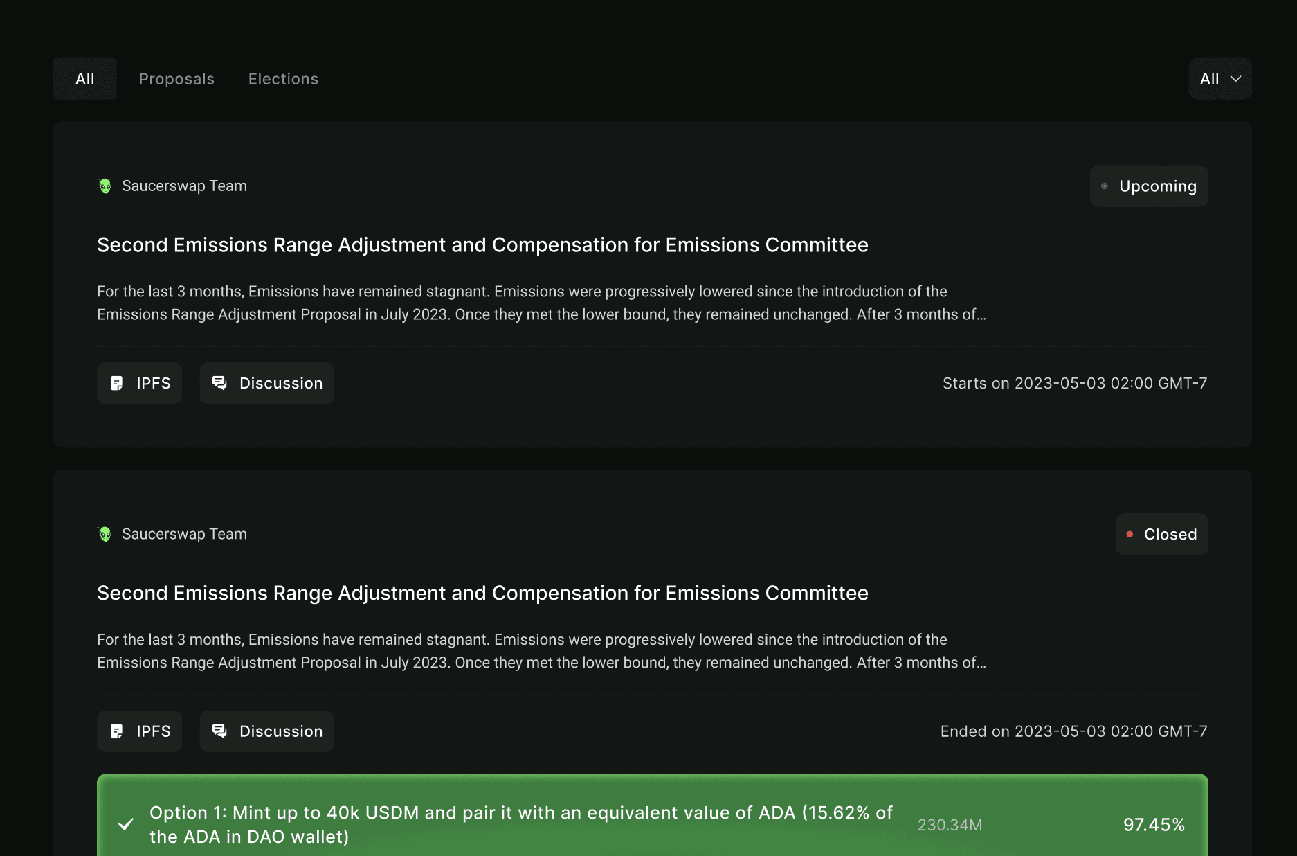
We also cleaned up the menus and dropdowns, made sure every button and link is easy to tap, and double-checked the spacing so your eyes know exactly where to look. Whenever you hover over or click something, you get clear feedback buttons glow, rows highlight so you always know you’ve done it right.
Finally, we put everything into a clickable demo so you can try the new swap, liquidity, staking, and voting flows yourself. We added notes for the developers like test wallet logins and example transaction details and handed over all the design files, components, and style rules. Now the team has everything they need to build it just as we envisioned.


“ Mahtab and Angelo smashed our tight deadline; delivered an end-to-end redesign, new features and a rock-solid design system. Our dev team loves the prototype, and our community can’t wait to vote on-chain.”

Hashburglar
Co-founder | SaucerSwap


Get in Touch to level up
your product’s UX & design system