PriorCut Case Study:
Brand Identity & Guidelines
PriorCut is a technology platform built to streamline day-to-day operations for barbershops: booking, client management, billing and more; so stylists can focus exclusively on their craft. At launch, PriorCut had no distinct visual identity or guiding strategy: no clear logomark, no app icon, and no unified system to ensure consistency across digital and print touchpoints.
Texus, USA
2024
Tech
Brand Designer
Feb - Mar 2024
Brand Strategy
Logo & Icons
Brand Guidelines
Challenge
PriorCut arrived with a fractured visual identity lacking a consistent logo, app icon, color palette or usage rules. This led to brand confusion across web, mobile and print assets, forced every new design into lengthy back-and-forth and slowed down every launch.
Results
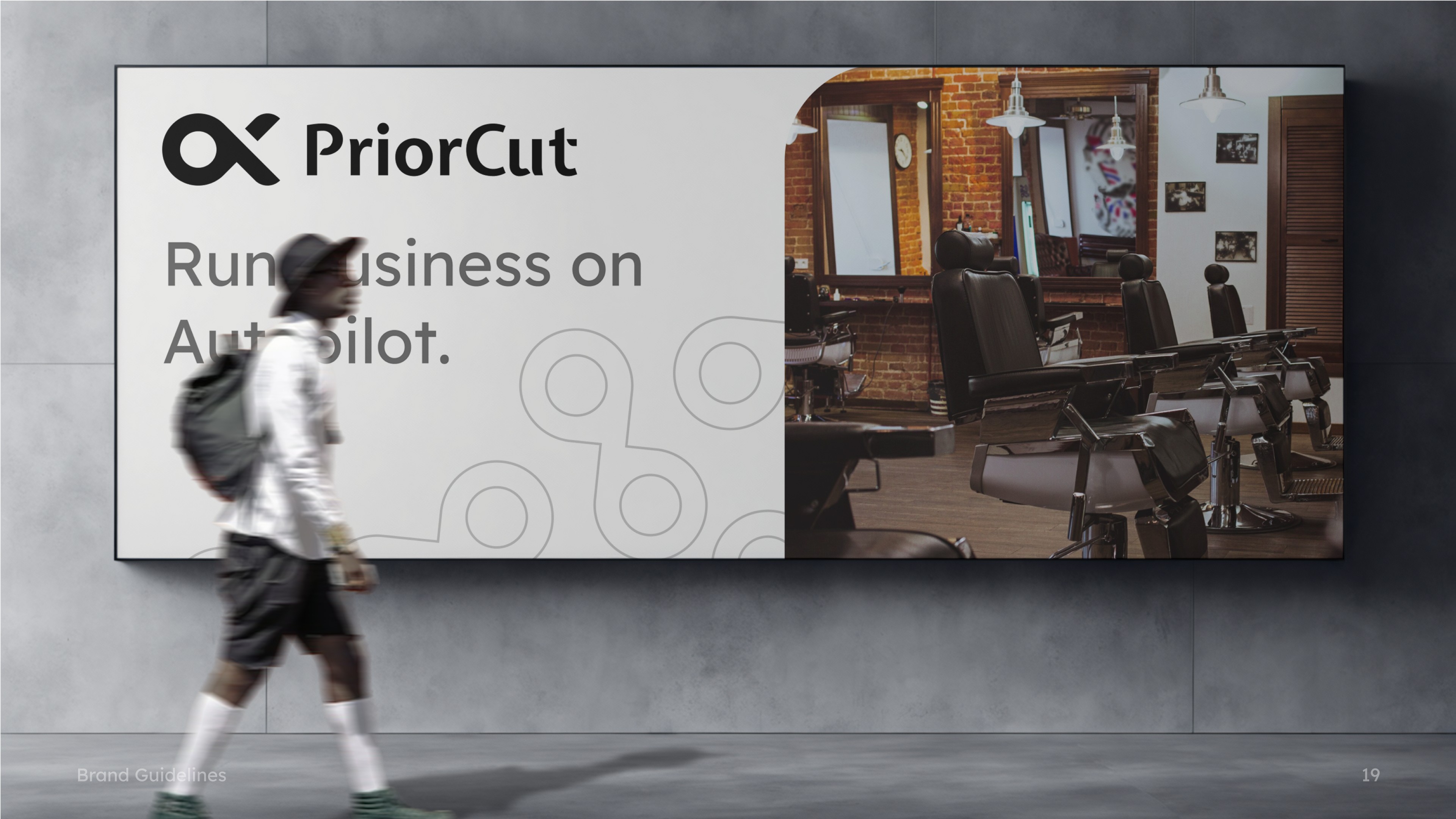
In six weeks we crafted a striking “P” logomark, harmonized macOS and iOS app icons and produced a 20-page Brand Guidelines book covering color, typography, patterns and clear misuse rules. The new system drove immediate impact:
35%
Increase brand recall
50%
Fewer revision cycles
40%
Faster asset production


Process
Discovery & Strategy
Kicked off with a brand-strategy workshop via video call defining PriorCut’s mission (“revolutionize barbershop operations through simple, powerful tech”), vision and core messaging pillars. Created a concise Brand Strategy brief outlining dual focuses: “Prioritizing what matters” and “Cutting through complexity.”
Logo & Icon Design
Sketched 10+ initial logomark concepts combining “P” and barber-related motifs. Refined top three directions in Figma, gathering real-time feedback. Finalized a stylized, forward-leaning “P” symbol, optimized for digital and print.
App & Web Assets
Developed matching square and circular app icons: light and dark variants; for iOS, Android and macOS docks. Delivered favicon sets and prototype embeds to the PriorCut web team.
Brand Guidelines & Stationery
Compiled a 16-page Brand Guidelines PDF covering: Logo usage, safe-zones & incorrect treatments
Color palette (Black, White, Raisin Black, Onyx, Dim Gray, Buttermilk Gray, Silver)
Typography (Reader Pro family from Extra-Light to Bold)
Brand patterns & iconography library
Applications: business cards, letterhead, lanyards, ID badges
Annotated each spec with export settings and file naming conventions to eliminate ambiguity at handoff.

“The new branding captures our mission perfectly: clean, bold, and instantly recognizable. The guidelines have been a lifesaver for our growth team and devs alike.”

Ron Fenceroy
CSO, Co-founder | PriorCut Technologies


Outcome
Cohesive Identity: A modern, confident visual system that clearly differentiates PriorCut from generic “tech” and “beauty” competitors.
Efficiency Gains: The comprehensive guidelines and pre-exported asset kits slashed internal QA cycles by 40%, allowing the dev team to integrate new branding across web and mobile without back-and-forth.
Scalability: The symbol-only logomark scales seamlessly from 16×16 px favicons to full-page print posters.
Get in Touch to level up
your product’s UX & design system